So I am calling it Generic American with a splash of Modern Vintage…I guess. I’m having one of those moments as a designer when the ‘correct’ images are present in my mind’s eye, but for various reasons they haven’t formulated on the canvas. Yet…but what the heck - I’m in no real hurry. I want to savor the taste of this one.
I absolutely love working on peacefield.info. It is a designer’s dream, absolute creative freedom. An opportunity to shine, explore, create and innovate.
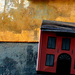
So what do I have to work with? Not much yet, and that is ok in some respects, because I don’t want to ever steer away from my built in ‘open source’ aesthetic: championing the best of free fonts and hacked, and neo-Dadaist imagery. This new concoction hopes to blend cinematic urban cityscapes, with an adaptation of the ever trendy rustic earth tone color palette.(see my post on the the Neo-Green Aesthetic)
Actually, keyboardist R. Bruce Phillips says it best:
Peacefield isn’t so “Pleasantville.” It’s grittier, even darker maybe – or at least it has that side. Kind of like in the face of the ubiquitous B&W photo of the old man who lives on the street. He is generic, he is vintage. His face tells who knows what variety of stories? Some lovely, and some horrific, to be sure.
But there is peace still. His old weather face still attracts us.
Some may not see readily the quality of peace about this town. They might think it a contradiction, or irony, that the gritty, mysterious town has such a “nice” name as “Peacefield.” Of course, America is full of contradiction and ironies, and people who don’t get it when others do.